3.2 Warming up
Let’s start with the warming up before starting.
3.2.1 Basic example CSS animation
CSS animation lets an element gradually change from one style to another.
CSS animation consist of two components :
-
A style describing the CSS animation
-
A set of keyframes that indicate the start and end states of animation’s style
Here is a simple example. In this example, the background color of one element is gradually changed from red to yellow over 5 seconds.
To create a CSS animation, you need two steps :
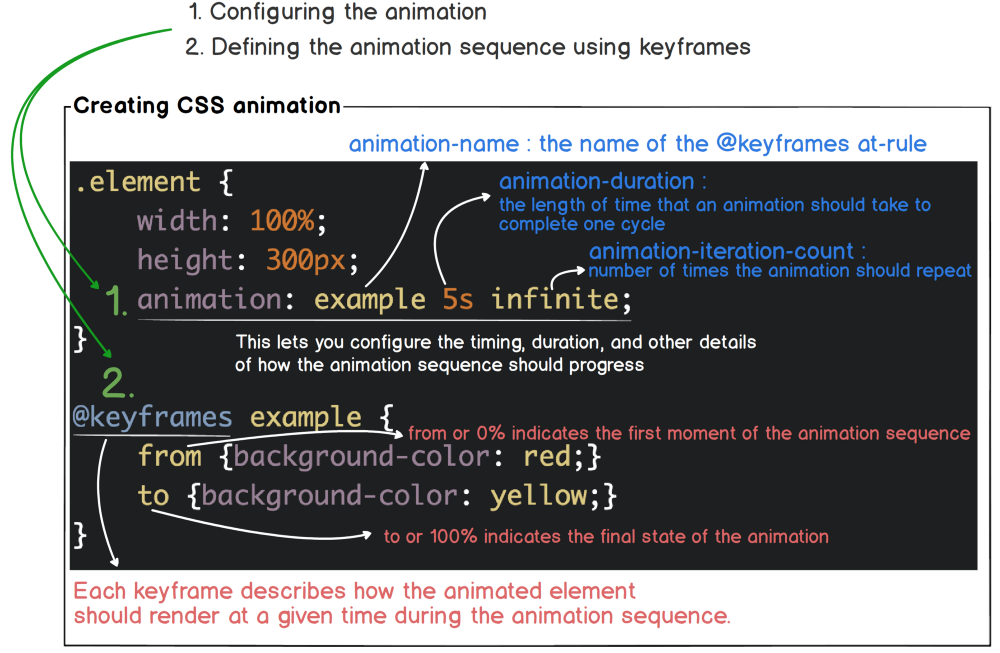
Check out Using CSS animations for more details
3.2.2 Another example CSS animation
Here’s what we’re starting with. It’s got a Tesla header, some title and a nice Tesla car image.
3.2.3 Making it bounce
Here are three elements nicely placed. Let’s see these three elements slowly appear on a white screen, as one or two actors dancing on a stage with nothing on the white background.
First, define the animation sequence using keyframes. Then apply the animate-pop-in class with the animation property defined to the div and h1 elements.
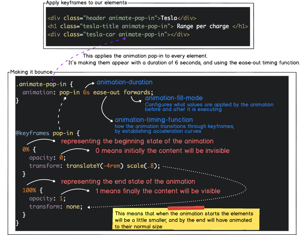
Now you can see that the three elements appear slowly increasing in size over 6 seconds.
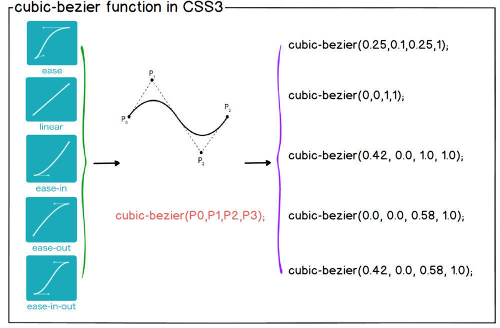
3.2.4 Cubic Bezier
In our example we used ease-out with an animation-timing-function. Easing functions specify the rate of change of a parameter over time. There are four predefined timing functions we can use, they are ease, ease-in, ease-out, ease-in-out and linear.
-
ease — speeds up a little through the middle, and then slows down towards the end
-
ease-in — starts of slowly, and accelerates through to the end
-
ease-out — starts of quickly, and decelerates through to the end
-
ease-in-out — starts slowly, accelerates through to the middle, then decelerates through to the end
-
linear — constant animation speed throughout
It’s important that they are essentially based on the Bezier curve.
3.2.5 Creating Custom Speed
As in our real life, not all objects move at a constant speed, giving these variable speeds to the elements on the screen will give a more realistic movement. Using Cubic-bezier function, we are able to create custom speed.
However, defining the animation speed in the cubic-bezier function format is not intuitive.
Here is a fantastic tool to visualize how cubic-bezier works.
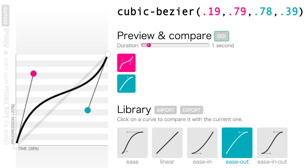
Here’s an example of applying custom speed instead of ease-out.
Now that the warm-up is over, let’s get started.