How to setup Media Queries with SASS Mixins

In this lesson, we'll learn how to use SASS Mixins to make managing Media Queries a breeze.

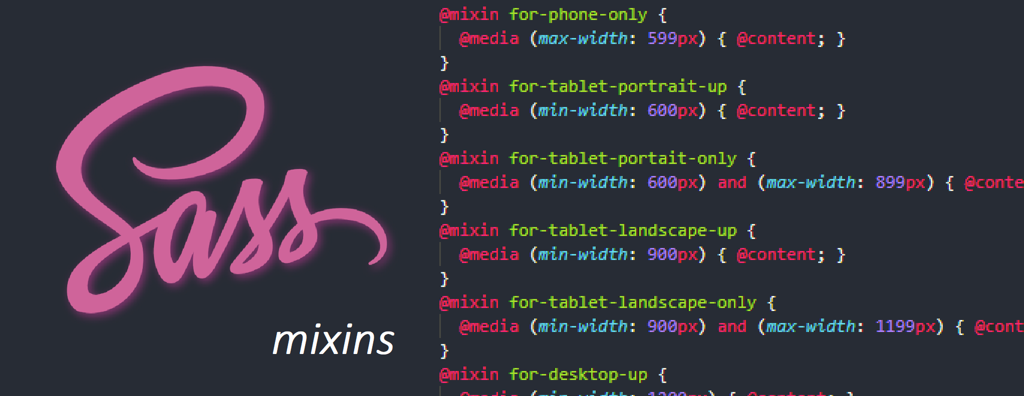
When building websites and apps, we’ll often use media queries to help ensure our layouts’ responsivity. This way, they can adapt to suit the multitudes of devices accessing them, as we need to ensure all of our users are catered for when engaging with our products.

CSS Media Queries #

If you have experience with CSS, you’ll likely know that a media query is a CSS3 module which allows content to render and adapt to conditions. Such as screen resolution, for example:

@media (max-width: 599px) {
 font-size: 1rem;
}

Here, we’ve set the font size to 1rem when the viewport size is <= 599px.

This is simple enough, and of course we’ll need multiple media queries to have a fully responsive site.

However, inevitably, the time will come where we’ll need to edit the rules for the actual breakpoints, and searching through all of your code to change every line affected by a rule change is far from ideal. There has to be a better way!

Modern layout specifications have improved greatly over the past few years, Grid and Flexbox are responsive by default. This helps us to cut down on the amount of media queries required in our projects & makes for cleaner code.

However, media queries still have a place in modern web development. And as our projects grow bigger, we need a better way of managing them.

Enter SASS mixins!

Mixins #

As we now know, SASS mixins give us the ability to create reusable chunks of code — they reduce repetition, promote dry code and allow for ease of maintenance.

So writing media queries as mixins to inject into your stylesheets, wherever they’re required makes a whole lot of sense!

Let’s now take a look at an example.

Setting up your mixins #

@mixin for-phone-only {
  @media (max-width: 599px) { @content; }
}
@mixin for-tablet-portrait-up {
  @media (min-width: 600px) { @content; }
}
@mixin for-tablet-landscape-up {
  @media (min-width: 900px) { @content; }
}
@mixin for-desktop-up {
  @media (min-width: 1200px) { @content; }
}
@mixin for-big-desktop-up {
  @media (min-width: 1800px) { @content; }
}

Here, we’ve written up 5 common breakpoints into @mixin blocks.

The @content syntax is a directive of SASS which allows for the insertion of content later on, as you likely won’t be writing all of your queries at once.

Using a mixin #

Say we want to use a mixin to reduce the font size of our header text on mobile devices.

We add the mixin (nested under the appropriate class) as an include, like so:

.header-title {  
   font-size: 2rem;  
 
   @include for-phone-only {    
      font-size: 1rem; 
   }
}

When we compile our project, our @include will translate into:

@media (max-width: 599px) {
   font-size: 1rem;
}

We now have the ability to easily insert our media queries wherever we like throughout our projects!

Additionally, we won’t need to memorize our breakpoints, as we have them pre-defined. If we need to alter them, we can simply edit the mixins.

Another way to setup our mixins #

If you want to take it a step further, you could use conditionals to setup your mixins.

You create just one @mixin block and set the parameters to be passed in — which we use to select our breakpoints, like so:

@mixin for-size($size) {
  @if $size == phone-only {
    @media (max-width: 599px) { @content; }
  } @else if $size == tablet-portrait-up {
    @media (min-width: 600px) { @content; }
  } @else if $size == tablet-landscape-up {
    @media (min-width: 900px) { @content; }
  } @else if $size == desktop-up {
    @media (min-width: 1200px) { @content; }
  } @else if $size == big-desktop-up {
    @media (min-width: 1800px) { @content; }
  }
}

Then, to use our mixins in this manner, we’d select it like so:

.header-title {  
   font-size: 2rem;  
 
   @include for-size(phone-only) {    
      font-size: 1rem; 
   }
}

It’s that simple!

Writing media queries doesn’t need to be a headache, and by using SASS mixins, we have one centralized location in which to manage our media queries.

Handling the responsivity of our projects just got a whole lot easier!

That’s it! Congratulations for completing the course! You’re now equipped with all the knowledge and tools required to implement SASS effectively, on any or all of your future projects.

Keep that momentum going & use it on the next one!

- Tim

Get hands-on with 1200+ tech skills courses.