CSS Grid, Baby Steps
Now that you understand the basic terminologies, like an adventurous kid, let’s get kicking!
We'll cover the following
How do you Define a Grid?
Just like Flexbox, everything begins with a one-liner. display: grid or display:inline-grid for an inline version.
For example, to make a certain div a grid container, do this:
div {
  display: grid;
}
How do You Create Columns and Rows?
A grid without columns and rows is kinda pointless.
To create columns and rows within a grid container, you use the two new CSS properties: grid-template-columns and grid-template-rows.
So how do you use these? Pretty simple.
grid-template-columns defines the placement of the columns while grid-template-rows defines the placement of the rows within the grid container.
How it actually works is you pass in length values into these properties, and they create row and column tracks within the grid container.
Look at an example below:
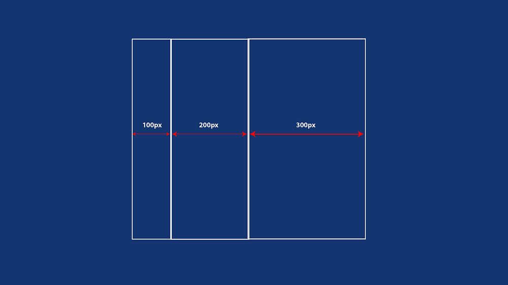
grid-template-columns: 100px 200px 300px
This will create 3 new columns within the grid container. The first with a length of 100px, the other, 200px and the last, 300px.
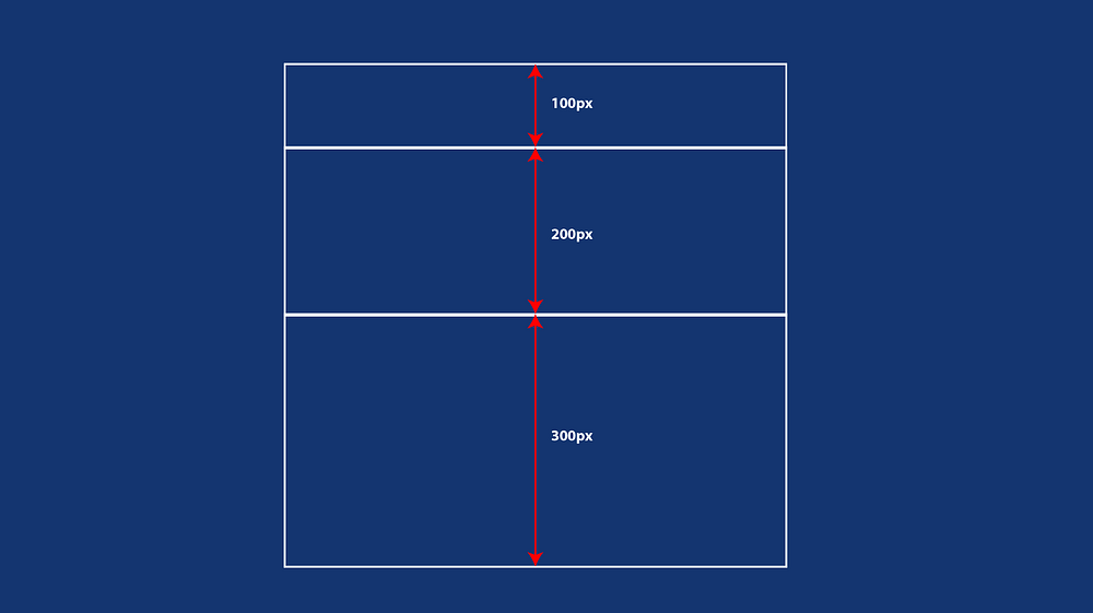
grid-template-rows: 100px 200px 300px
This will create 3 new rows within the grid container. The extents are shown below
Now put these together, and you get a full grid — with rows and column defined.
.grid-container {
  display: grid;
  grid-template-columns: 100px 200px 300px
  grid-template-rows: 100px 200px 300px
}
Get hands-on with 1200+ tech skills courses.