Time to Code — CSS Grid, Hands-on
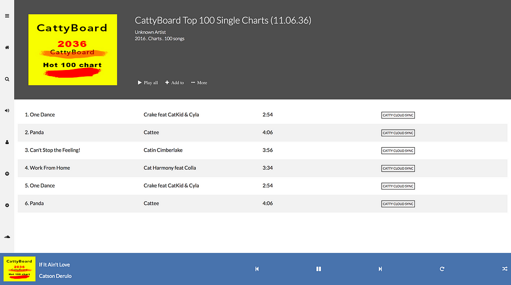
Now let’s take baby steps to building a clone of the famous music app, Catty Music 😁
How to Create the Basic Grid Setup for Catty Music
We will kick off with a very basic html document.
<body>
   <aside></aside>
   <main></main>
   <footer></footer>
</body>
There’s a bit of foresight involved in choosing this structure. You’ll understand very soon.
Also note how semantic the markup is. This is one of the advantages of using the CSS grid. You save yourself the hassles of using redundant container markup.
Now style the document.
body {
   display: grid;
   min-height: 100%
}
This will kick off the grid formatting context by making body a grid-container
Now we can go on to define the row and column structure within the grid.
How to create the Rows and Columns for Catty Music
Creating the rows and columns is pretty easy. The final design we are gunning for is this:
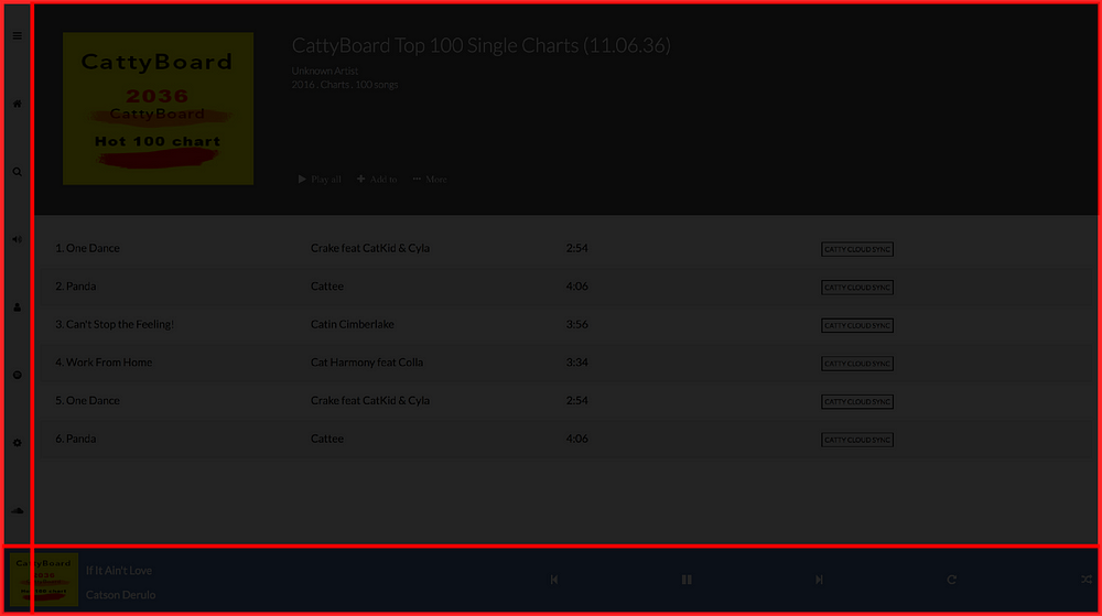
However, the initial grid setup we need is a grid of 2 rows and 2 columns.
Here are a few things to note about the column setup
-
The first column must have a fixed width — say, 50px
-
The second column must fill the remaining width in the grid.
On Row Setup:
- The second row must have a fixed height — say, 100px
- The first row must also fill the remaining height within the grid.
The lay-man’s solution.
If you’re NOT very experienced with CSS, you’re likely to write this:
body {
   ...
   grid-template-rows: 100% 100px;
   grid-template-columns: 50px 100%;
}
The problem with this is that you have accidentally created a grid whose width and height is a total of 100% + 50px
We want a total width and height of exactly 100%, so this approach is wrong.
The ‘smart’ person’s solution.
If you’ve got some experience with CSS, then you’re likely to do something much more smarter. Like this:
body {
   ...
   grid-template-rows: calc(100% - 50px) 50px;
   grid-template-columns: 50px calc(100%-50px);
This is pretty smart. But it’s got one problem — it isn’t very maintainable.
For example, if you have to change any of the the fixed widths, then you must always change the calc definition every time .
The Efficient Solution
Luckily, CSS Grid has a new unit that solves this problem elegantly.
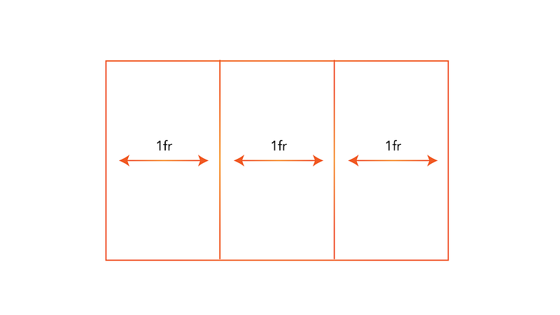
The fractional unit (fr)
The fractional unit solves the problem of automatically distributing space.
If you have three grid columns aligned as shown below, the fractional unit will automatically distribute the space equally.
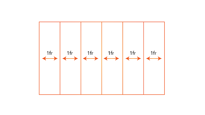
If for some reason you add more elements — no worries. The fr unit will equally redistribute the space .
Finally, if you have a fixed width element, then you can take up the remaining space with the fr unit.
Here’s what I mean:
body {
   ...
   grid-template-rows: 1fr 50px;
   grid-template-columns: 50px 1fr;
And that is it — done! 50px will be allocated to the fixed tracks, and the remaning space taken up by the other grid track.
If you’re still confused with fr unit, please check out, the CSS Fractional Unit (Fr) In Approachable, plain Language. It only takes 3 minutes to read.
Get hands-on with 1200+ tech skills courses.