Box Model Review
In this lesson, we will understand how margin, border, padding, and element dimensions determine how we create websites using boxes.
We'll cover the following
Introducing the box model
HTML works with boxes. A website is composed of many boxes organized in a layout. Since Flexbox is used for layouting, we have to understand how each box in a layout is built.
A box has four groups of properties that determine its size:
- Element dimensions: the width and height
- Padding: the empty area around the content area. The background colors, gradients, and images are still displayed on the padding area.
- Border: an area separating the margin and the padding. Typically, borders are lines, dashed lines, dotted lines, or other three-dimensional effects. If the background is visible behind the border, the background colors, gradients, and images are still displayed on the border area.
- Margin: the empty area around the border. The background of the element is not visible on the margin.
Setting the margin and padding
Margins and paddings are set in CSS using the margin and padding CSS rules respectively. Margin and padding rules work in the same way, and they can contain up to four values. The values for both are distributed as follows:
- One value:
top,right,bottomandleftmargins are set simultaneously - Two values: the first value corresponds to the
topandbottommargin/padding. The second value sets theleftandrightmargins/paddings. - Three values: the first value sets the
top, the second corresponds to therightandleft, the third corresponds to thebottommargin/padding. This is the hardest to remember because the right-left grouping is not fully intuitive - Four values: the order of values is
top,right,bottom,left.
You can revise the above order of values by imagining a clock. If you rotate a pointer clockwise starting at 12 o’clock, then you get the margin or padding values in the following order: top, right, bottom, left. This already gives you the four values setting.
To determine the rest of the rules, imagine that you scan the available values like the scanner of KITT in Knight Rider. You start on the left, you go right as long as you can. Then you turn left again. This explanation holds for all configurations.
Let’s see an example:
.one-value {
  margin: 20px;
  padding: 10px;
}

.two-values {
  margin: 20px 10px;
  padding: 20px 10px;
}

.three-values {
  margin: 20px 10px 30px;
  padding: 20px 10px 0;
}

.four-values {
  margin: 10px 20px 30px 40px;
  padding: 10px 20px 30px 40px;
}
It is also possible to set the margin and padding values individually using the -top, -right, -bottom, -left suffixes after margin or padding:
.top-and-bottom {
  margin-top: 10px;
  margin-bottom: 20px;
}
box-sizing
We will now learn two types of box-sizing methods: the content box and the border box.
Content box
In the content box model, the width and the height specifies the area inside the padding. This is the default model.
Suppose we have the following box and our viewport width is 540px:
<p class="box">Block</p>
.box {
  width: 300px;
  margin: 20px auto;
  padding: 30px;
  border: 5px dotted black;
  background-color: lightblue;
}
The box model looks as follows:
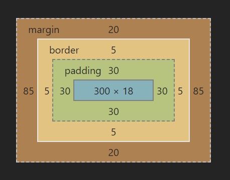
- The content area is blue. The width was set as
300px. In this situation, the height of the content area is computed as18px. - The padding around the component is the green area, it is set as
30px. - The border around the padding area is yellow in the box model. It is 5 pixels wide.
- The top and bottom margins are set to
20px. The left and right margin are set to auto. So the browser performs the following calculation:
(540px - 2 * 5px - 2 * 30px - 300px) / 2 = 85px.
Out of 540px, the content area occupies 300px, the left and right padding are 30px each, the left and right border are 5px each. This leaves 170px for the two, equally divided margins, yielding 85px.
border-box
The width and the height of a border box equals the area outside the border. It includes the border, the padding, and the content area.
Border boxes are easier to use than content boxes, but they are more difficult to understand. This is because, on an intuitive level, we tend to equate the width and the height properties to the dimensions of the content areas only. This is not true in a border-box.
Let’s add the box-sizing: border-box rule to the CSS of our box:
<p class="box">Block</p>
.box {
  width: 300px;
  margin: 20px auto;
  padding: 30px;
  border: 5px dotted black;
  background-color: lightblue;
  box-sizing: border-box;
}
What is the width of the content area?
What is the width of the content area of a border box element having a 300px width, 30px padding, and 5px border?
300px
230px
370px
290px
If you are stuck with calculating the dimensions of your border box, click the hint below to reveal the box.