Box Model Engineering to perfection
Introduction
This is the fourth and final part of the box-model series. This document complements the most current versions of appearance and code from the middle two shots. The overall goal has been:
Once you have decided what is important you should be able to increase different types of performance WITHOUT compromising on stability or increasing complexity.
Context
The two starting points for this article can be seen from these links
Objectives
This is the final part of four on the Box Model. It addresses the following issues of polishing and clarification:
- The UI is inaccurate See 1. Toughen the UI spec’ where appropriate
- The UX is wrong See 2. Buildup Styling of html Buttons.
- Short Code was NEVER shown See 3. Examine shorter-code alternatives
1. Toughen the UI spec. (where appropriate)
The “box objective” should be as stable as possible when the user demands unexpected scale and font combinations. An obvious way to test a UI is by making the view wider than the designer intended.
I should mention that there are webpages built to adapt to this; however, we have a “fixed model” HERE and so there should be NOTHING complicated to see. Although it was possible to show this with the existing data and structure, I felt that our example so far was NOT showing this strongly enough.
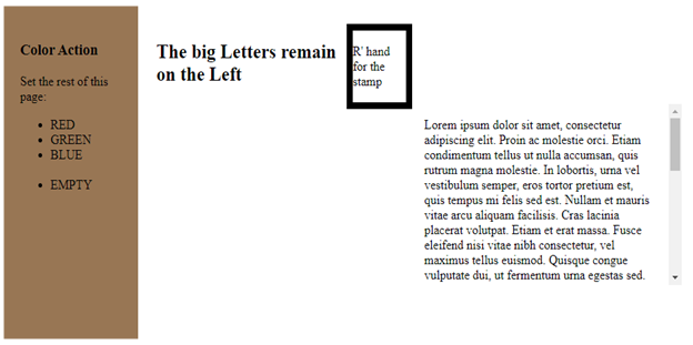
After all, the data in the example was made up to show a GENERIC model. Still, the data as it existed was actually HIDING a generic bug, so I re-formed the data to correct this difficulty. You see this represented by the color-coded schematic-sequence below:
This is an inaccuracy of construction and MUST be addressed. The solution for excessive narrowing is beyond the scope of our current discussion; however, there is a straightforward remedy for excessive widening.
After reading through the CSS and HTML, it is fairly easy to describe what the above sequence has shown: there are only two parent containers on the whole page that DON'T have explicit position-properties.
In the simplest version of this, it means one would be underneath the other. The reason we have something different is that the two divs both have defined size properties.
The first div stays on the top left-hand corner because it is the first (non-positioned) item within the body. Then, the second one tries to get both below the first and beyond the first's right-hand edge. This always works when done vertically, but horizontally, it only happens in one picture where the view is wide enough to allow the two divs (uncropped) to stand side by side. When the effort to prevent this nonsense is small enough it should ALWAYS be carried out.
The following answer has met the problem:
2. Buildup styling (of HTML buttons)
Background
In our HTML, we are constructing list items within an unordered list. The HTML syntax demands both a <ul>, which is the parent container, and a <li>, which is the child member of that list.
In the most general case, the Style section universally changes the definition of li by presenting EVERY "list item" as a “Button”.
There is an obvious limitation to this, sometimes a cigar is just a cigar!, but it is wholly useless to implement our "button" solution by messing up every other list item within the page.
Fortunately, a single, built-in rule provided by CSS solves this exact problem; it's called “Parent-Child Inheritance". Parent-Child Inheritance empowers us to limit this change to only the list items belonging to that <ul>.
The CSS that modifies this can be run by a single rule, “Parent-Child Inheritance”.
Those who know basic CSS may well object to such an extravagant method when a sub-class of <li> is a far more orthodox way to achieve exactly the same effect. For now, we will continue to work with "Parent-Child Inheritance" (with the clear understanding that this decision must be fully justified later).
Temporary assumption
There are two sets of rules. The order in which they are implemented is important.
Working with Unsorted List (UL) alone
Here, the styling instructions come from the parent. The {s} class has changed the prefix icon into a square. Below that, the {pusher} class has both removed the prefix icon and effectively switched off the system-default indentation.
Working with both UL and the List Item (LI)
The following example shows how styling instructions for the child element depend on both the “Styling from the parent” and “Styling from itself”.
The upper half of this picture holds the default appearance of ul and li. The lower half of it shows the styling-instructions that are going to be used within the second picture.
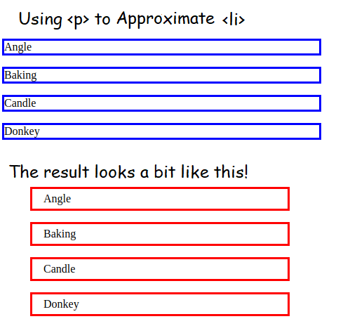
Try to make the <li> RESEMBLE a paragraph
A “Quick and Dirty” approximation for making the {List Items} into buttons is to try something reasonably similar with {Paragraphs}. Below is the corresponding code:
Conclude Ground-Rules for “Buttons”
All the discussion above has been about is the interaction of styling rules in which the order doesn't matter. For example, when rule-A says, "symbol prefix is SQUARE", and Rule-B says, "text color is DARK GREEN", it makes no difference in which order the rules are followed.
In contrast to this, the third example requires overriding the system's built-in margins and then setting our own ones beyond that. Here, the two styling instructions must be applied in one specific order.
Since the container acts as a Parent and every list item acts like a child, the appropriate fit is:
Original decisions are made by the Parent but beyond that, the rules come from the Child-level.
This fits the “Temporary Assumption” defined above, so the actual CSS structure used from here on is:
3. Examine shorter-code (alternatives)
The full-version (safe and strong) coding structure is not the only way this can be done. Ultimately, the code is worth the effort future programmers are realistically likely to continue. Think of it like “Password-Rules” - those who make “Logging into the corporate network” too complicated end up with users who hand-write them where everyone can see. Since I implied that five lines are possible instead of 50, it is only fair that this is shown for those of you who intend to work in that way.
function describedBackground(calledFrom){let coded=calledFrom.getAttribute('data-shade');var listElem = document.getElementsByName('describer');for(var i=0;i<listElem.length;i++){listElem[i].style.backgroundColor = coded;}}
Bringing it all together
We started this document with three objectives, and each one taught us a different lesson:
Firstly, the "UI performance" showed that fixed design should not give odd results when the user demands something possible; this still applies even when it is fairly unlikely. We addressed this inaccuracy of construction, and it turned out to be a tiny styling alteration that solved a major generic bug.
Secondly, there is the “Button Appearance” demanded by basic UX standards that a button has to look like a button! We practiced the obvious fixes, which served as a starting point for the systematic progress that we needed. The progress was mostly developing the CSS-Styling.
Thirdly, the "Lighter Code", showed that heavy-handed methods are not always the best way forward (this applies even when it works and has other advantages). We added a single parameter to the HTML that removed about three-quarters of the codebase.

