What is a boxplot in R?
Boxplots are used to measure how well data is distributed in a dataset, also known as data dispersion.
The data set is divided into three different quartiles. The graph below shows the values of minimum, maximum, median, first quartile, and third quartile.
It is helpful to compare the data distribution across the datasets by sketching a boxplot regarding each dataset.
The boxplot is made in the R language by using the boxplot() function.
Syntax
boxplot(x, data, notch, varwidth, names, main)
Parameters
x: represents the vector or formula.data: a data frame.notch: a logical value and it must be set astrueto draw the notch.varwidth: another logical value and set to true for drawing the width of the box which is proportional to the sample size.names: group labels for each boxplot.main: shows the title of the graph.
Return value
This function will return the following values:
-
stats: This contains the matrix with columns containing values like a lower hinge, upper hinge, median, extreme of lower whisker, extreme of upper whisker. -
n: This represents the vector that contains the number of observations in every group. -
conf: Matrix where each column contains the lower and upper extremes of the notch. -
out: The values beyond the extremes of the whisker. -
groups: This vector has the same length as the out and its elements represent that the outliers belong to which group. -
names: Vector containing the names of groups.
1. Demo example
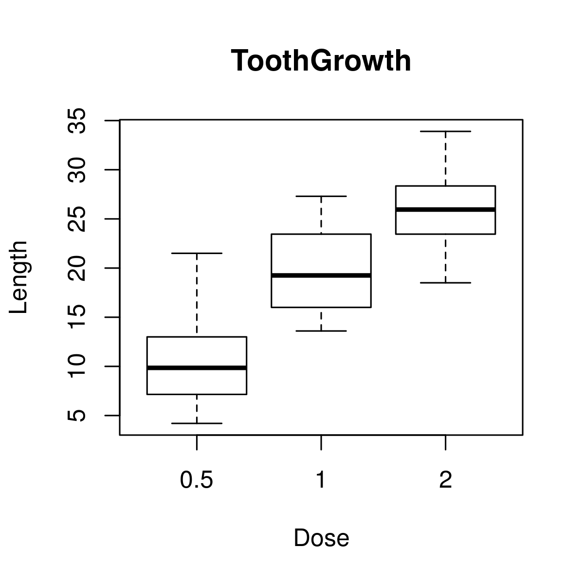
The dataset used in the following example is the ToothGrowth dataset. It is available in R’s environment. The code below helps to draw a boxplot for the relation between len and dose. We use it to create our graph.
# load datasetdata("ToothGrowth")# plotting the chart.boxplot(len ~ dose, data = ToothGrowth, xlab = "Dosage",ylab = "Range", main = "ToothGrowth")
2. Demo example: boxplot with notch
Boxplot with notch helps find the median of multiple data groups that are equal to each other. The code below is an example of how to draw a boxplot with a notch for every data group.
# Load datasetdata("ToothGrowth")# Plotting chart.boxplot(len~ dose, data = ToothGrowth,xlab = "Dose",ylab = "Length",main = "ToothGrowth",notch = TRUE,varwidth = TRUE,col = c("red","green","blue"),names = c("Less","Average","More"))
