What is fluid design?
Fluid design
A
The widths of page elements in fluid web design are equal to the width of the screen or browser window. The width of the existing viewport defines whether a fluid website extends or contracts. The fluid design makes websites more available on a range of computers of diverse screen sizes. Fluid design is adaptable in the same way that responsive and adaptive sites are, but it doesn’t depend on fixed units (even computers use the same bandwidth percentage). As a consequence, it is still able to fill the page’s width.
Fluid Layout
Fluid layout is a layout that uses proportional values as a measurement unit for blocks of text, images, or any other object that is a part of the WordPress style (according to WordPress theme development terminology). This helps the web page stretch and contract in reaction to the scale of the user’s screen.
Techniques involving the fluid layout design
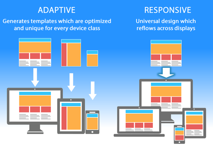
Simply put, responsive design is fluid and adapts to the screen size independent of the target device. However, just one of these aspects is needed for the site to conform to various screens. Responsive uses
Fluid layout in Bootstrap
One may use the container-fluid class in Bootstrap to construct fluid layouts that use the full width of the viewport on all devices (extra small, small, medium, large, and extra-large). Instead of adding various widths with different viewport dimensions, the container-fluid class clearly adds the width: 100%.
How does the fluid layout pattern fill the screen?
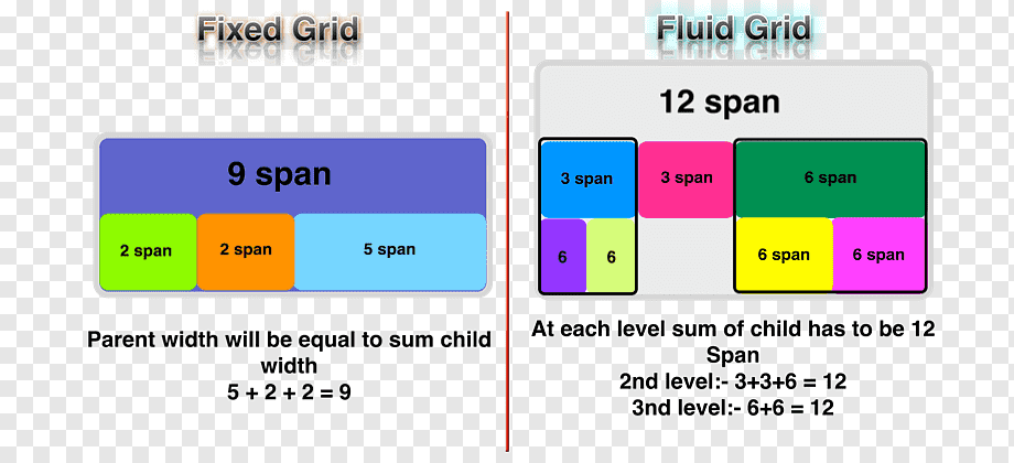
Fluid pattern is made up of a fluid grid – it typically keeps the same size on big or medium displays, with the margins changed on larger screens. The fluid grid allows the main content to reflow on smaller screens when columns are placed vertically.
Adaptive design
Adaptive design is a type of graphical user interface (GUI) that responds to various screen sizes. Designers use it in GUIs (such as webpages) that must operate on a variety of devices. Adaptive design, in other words, begins with a few fixed formats and then picks the right one for the existing screen size.
Example of Adaptive design
When a browser is opened on a laptop, the web selects the most suitable layout for that screen – resizing the window has little effect on the layout template. Adaptive design has been rapidly adopted by


