What is the tooltip in Flutter?
Tooltip
Flutter is an open-source framework by Google for building beautiful, natively compiled, multi-platform applications from a single codebase.
A material design Tooltip provides text labels that help explain a button’s function or other user interface action.
Usage
- For using the tooltip feature in a flutter, you need to wrap the button inside the tooltip widget, and then the message/description will be shown when that button is long pressed.
- Many widgets, such as IconButton, FloatingActionButton, and PopupMenuButton have a tooltip property that, when non-null, causes the widget to include a Tooltip in its build.
- Tooltips in flutter increases the accessibility of visual widgets. It provides them with the textual representation of widgets that screen readers can vocalize.
- When using the Tooltip, we provide it with the message displayed when the tooltip function is called. It is displayed when the user taps through the UI when they long press on it or hover on the UI. Tooltip also exports the message into semantics, so screen readers can vocalize them. We can also customize the tooltips with vertical offsets, height, and more.
Code
Here is the code for the example of tooltip in flutter.
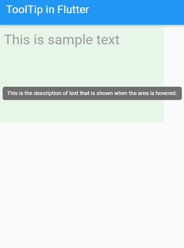
@overrideWidget build(BuildContext context) {return Scaffold(appBar: AppBar(title: Text(widget.title),),body: Container(child: Padding(padding: const EdgeInsets.all(12.0),// calling the tootip class herechild: Tooltip(// description message that is to be displayedmessage: 'This is the description of text that is shown when the area is hovered.',// this is the widget on which the display message is to be displayedchild: Text('This is sample text',// some styles for the widgetstyle: TextStyle(color: Colors.grey,fontSize: 25,),),),),// backgeoung color on screencolor: Colors.green[50],width: 300,height: 175,),);}
The output of the code above is displayed below:
The complete code above can be downloaded from the link.