What happens when you switch flex-direction?
Explore how switching the flex-direction property in CSS Flexbox changes the main and cross axes, affecting layout orientation and behavior of flex properties like flex-basis and flex-grow. Understand why properties that influenced width now affect height and how to align items correctly when the direction changes. This lesson helps clarify a common confusion for beginners in flexible layouts.
We'll cover the following...
When starting off with learning the flexbox model, this part was the most confusing. I bet a lot of newcomers to the flex world find it that way too.
You remember when I talked about the default main and cross axis being in the “left-to-right” and “top-to-bottom” directions?
.jpg)
Well, you can change that too. Which is exactly what happens when you use flex-direction: column as described in an earlier section (remember the default value is flex-direction: row). When you do this, the main and cross axis are changed as seen below:
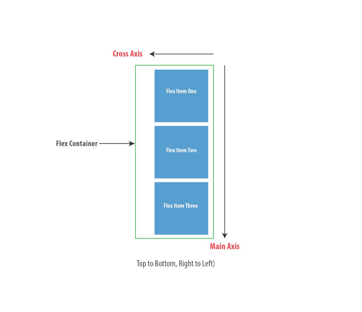
If you’ve ever written any text in the English language, then you already know the language is written from left-to-right and top-to-bottom. That’s equally the direction taken for the default main and cross axis ...