Traditional Layouting - Solution with Flexbox
Discover how to apply Flexbox to traditional layout problems by creating flexible containers that adapt to content and screen size. Learn to use flex-wrap and min-height to build responsive, multi-row column layouts and gain hands-on experience with practical CSS exercises.
We'll cover the following...
We'll cover the following...
Writing our first Flexbox container
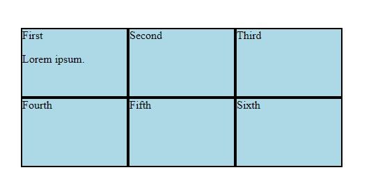
Let’s recall the code from the previous chapter:
<div class="container"><div class="col">First<p>Lorem ipsum.</p></div><div class="col">Second</div><div class="col">Third</div><div class="col">Fourth</div><div class="col">Fifth</div><div class="col">Sixth</div></div>
.container {margin: 50px;padding: 0;font-size: 0;}.col {display: inline-block;border: 2px solid black;width: 33.33%;box-sizing: border-box;margin: 0 auto;height: 100px;background-color: lightblue;font-size: 16px;}
After removing the fixes to glue the individual elements together, our layout falls apart:
.container {margin: 50px;padding: 0;}.col {width: 33.33%;border: 2px solid black;box-sizing: border-box;margin: 0 auto;height: 100px;background-color: lightblue;}
As expected, without the inline-block display mode, the six divs become blocks, occupying the whole row.
...
Let’s add display: ...