Building Layout
This lesson will cover how to create a layout for the login screen, which consists of username input field, password input field and login button.
We'll cover the following...
Final result preview #
To make it easier to understand what we want to achieve, here is a preview of the layout that we are going to build.


Root layout #
Let’s create a new activity_login.xml layout file inside app/src/main/res/layout folder. As a root layout, we are going to use ConstraintLayout:
<androidx.constraintlayout.widget.ConstraintLayoutxmlns:android="http://schemas.android.com/apk/res/android"xmlns:app="http://schemas.android.com/apk/res-auto"android:layout_width="match_parent"android:layout_height="match_parent"></androidx.constraintlayout.widget.ConstraintLayout>
Input fields #
While Android SDK provides EditText view as an input field, we are going to use TextInputLayout and its direct child TextInputEditText from Material Components library because of richer API and better visual parity with Material Design.
Let’s declare username TextInputLayout and TextInputEditText inside ConstraintLayout along with some specific XML attributes:
idattribute is used to uniquely identify and reference to this viewhintattribute shows input field hint text
...<com.google.android.material.textfield.TextInputLayoutandroid:id="@+id/textUsernameLayout"android:layout_width="match_parent"android:layout_height="wrap_content"android:hint="Username"><com.google.android.material.textfield.TextInputEditTextandroid:id="@+id/loginInput"android:layout_width="match_parent"android:layout_height="wrap_content" /></com.google.android.material.textfield.TextInputLayout>...
Note: All the above attributes use android namespace, which means those attributes are defined in Android SDK.
To align TextInputLayout we need to use ConstraintLayout attributes which are defined in ConstraintLayout library namespace and to access them we will use the app namespace:
layout_constraintStart_toStartOfattribute declares a constraint to align the start of the view to the start of theConstraintLayoutlayout_constraintEnd_toEndOfattribute declares a constraint to align the end of the view to the end of theConstraintLayoutlayout_constraintTop_toTopOfattribute declares a constraint to align the top of the view to the top of theConstraintLayout
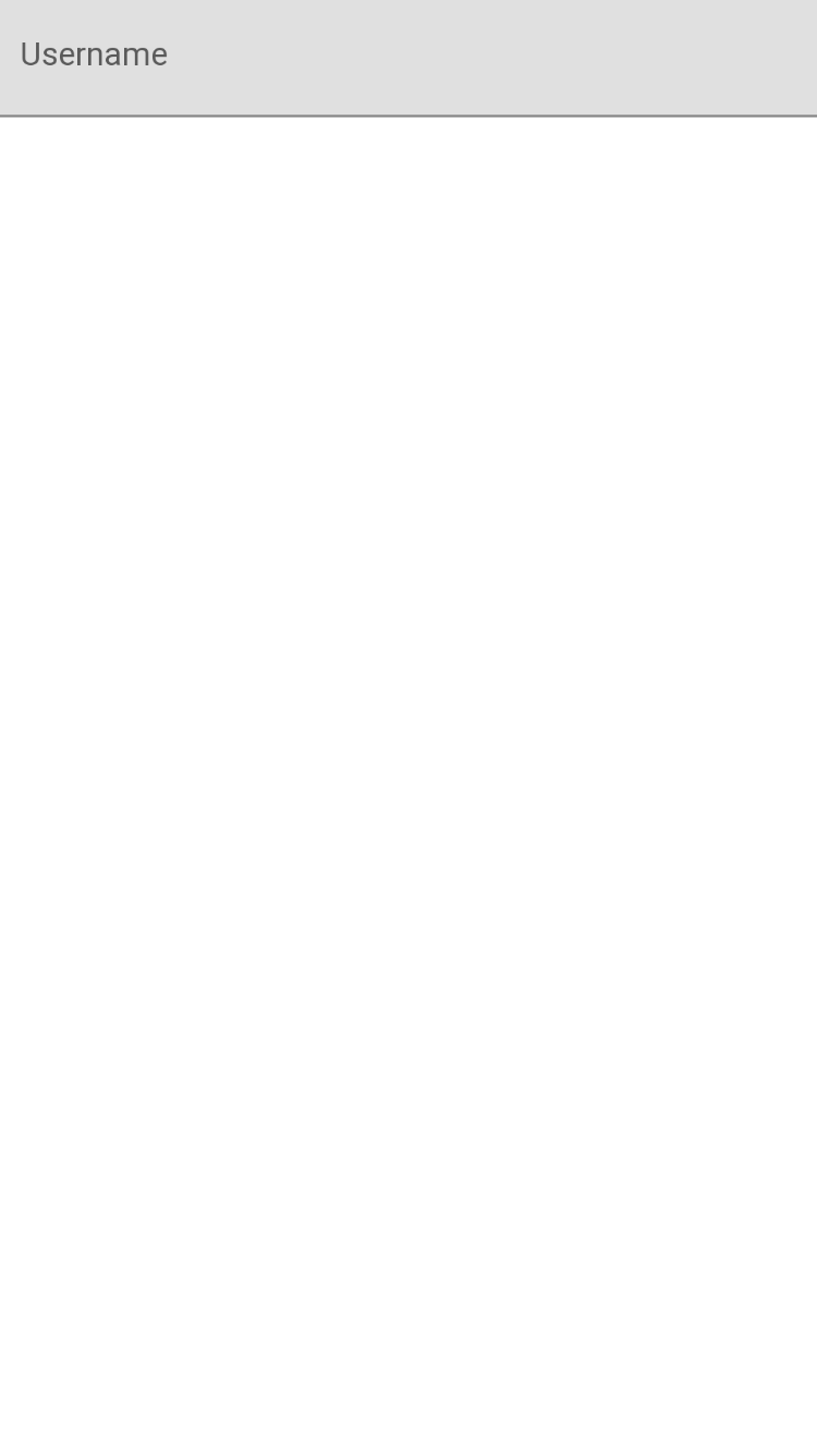
...<com.google.android.material.textfield.TextInputLayoutandroid:id="@+id/textUsernameLayout"android:layout_width="match_parent"android:layout_height="wrap_content"android:hint="Username"app:layout_constraintEnd_toEndOf="parent"app:layout_constraintStart_toStartOf="parent"app:layout_constraintTop_toTopOf="parent">...</com.google.android.material.textfield.TextInputLayout>...
Here is a preview of the layout.
Let’s add a password input field and place it under the username input field. Both username and password input fields are very similar. The difference is in the following attribute:
layout_constraintTop_toBottomOfattribute declares a constraint to align the top of the password layout to the bottom of the username layout usingtextUsernameLayoutid as a reference
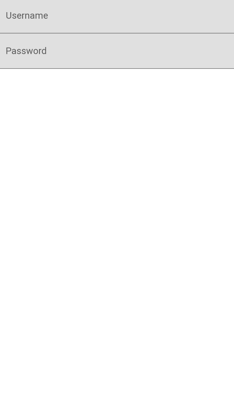
...<com.google.android.material.textfield.TextInputLayoutandroid:id="@+id/textPasswordInput"android:layout_width="match_parent"android:layout_height="wrap_content"android:hint="Password"app:layout_constraintEnd_toEndOf="parent"app:layout_constraintStart_toStartOf="parent"app:layout_constraintTop_toBottomOf="@+id/textUsernameLayout"><com.google.android.material.textfield.TextInputEditTextandroid:id="@+id/passwordInput"android:layout_width="match_parent"android:layout_height="wrap_content" /></com.google.android.material.textfield.TextInputLayout>...
Here is a preview of the layout.
Button #
The next step is to add the login button below the password layout.
While Android SDK provides Button view as an input field, we are going to use MaterialButton from Material Components library because of the richer API and better visual parity with Material Design.
Most of the attributes of the MaterialButton will be familiar at this point. The main difference is:
layout_constraintTop_toBottomOfattribute declares a constraint to align the top of the login button to the bottom of the password layout usingtextPasswordInputid as a referencetextattribute shows button text
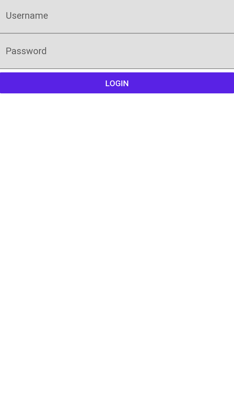
...<com.google.android.material.button.MaterialButtonandroid:id="@+id/loginButton"android:layout_width="match_parent"android:layout_height="wrap_content"android:text="Login"app:layout_constraintEnd_toEndOf="parent"app:layout_constraintStart_toStartOf="parent"app:layout_constraintTop_toBottomOf="@+id/textPasswordInput" />...
Here is a preview of the layout.
Alignment #
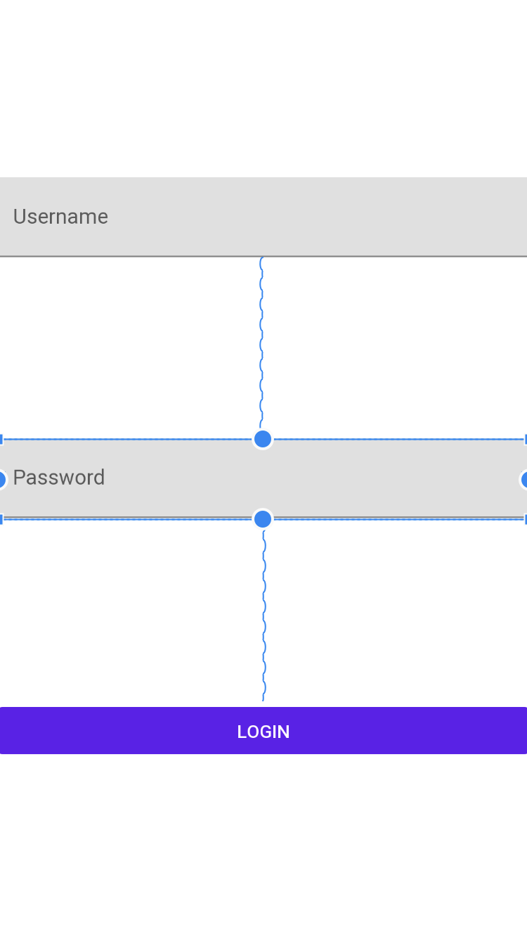
To align username layout, password layout and login button in the center of the screen we form a chain - a group of views that are linked to each other.
Let’s constrain the bottom of top component to the top of bottom component to distribute components vertically across the whole screen.
<androidx.constraintlayout.widget.ConstraintLayout...><com.google.android.material.textfield.TextInputLayoutandroid:id="@+id/textUsernameLayout"app:layout_constraintBottom_toTopOf="@+id/textPasswordInput"...><com.google.android.material.textfield.TextInputEditText.../></com.google.android.material.textfield.TextInputLayout><com.google.android.material.textfield.TextInputLayoutandroid:id="@+id/textPasswordInput"app:layout_constraintBottom_toTopOf="@+id/loginButton"...><com.google.android.material.textfield.TextInputEditText.../></com.google.android.material.textfield.TextInputLayout><com.google.android.material.button.MaterialButtonandroid:id="@+id/loginButton"app:layout_constraintBottom_toBottomOf="parent".../></androidx.constraintlayout.widget.ConstraintLayout>
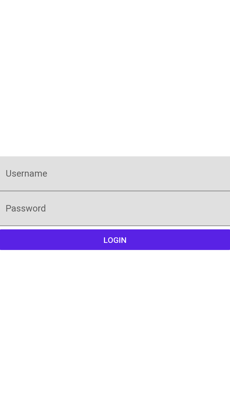
Here is a preview of the layout.
The final step is to apply a chain style to pack our views together:
layout_constraintVertical_chainStyleattribute is used to apply a particular distribution style for the chain
<androidx.constraintlayout.widget.ConstraintLayout...><com.google.android.material.textfield.TextInputLayoutandroid:id="@+id/textUsernameLayout"app:layout_constraintBottom_toTopOf="@+id/textPasswordInput"app:layout_constraintVertical_chainStyle="packed"...><com.google.android.material.textfield.TextInputEditText.../></com.google.android.material.textfield.TextInputLayout></androidx.constraintlayout.widget.ConstraintLayout>
Here is a preview of the layout.
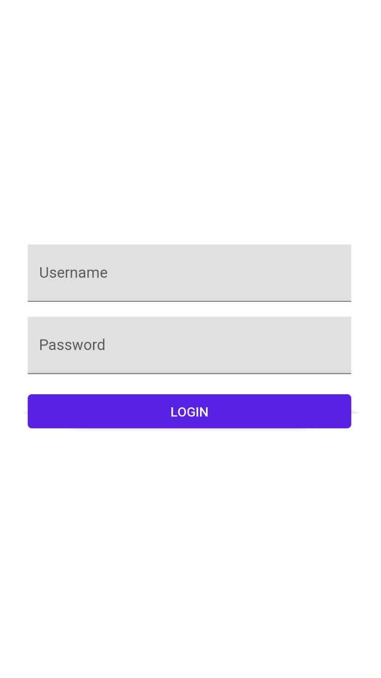
Margins #
To add a bit of space between username layout, password layout and login button the following attributes can be used:
layout_marginStartlayout_marginEndlayout_marginToplayout_marginBottom
These attributes add a specified dp value of margin to the start, end, top or bottom of the component respectively.
<androidx.constraintlayout.widget.ConstraintLayoutxmlns:android="http://schemas.android.com/apk/res/android"xmlns:app="http://schemas.android.com/apk/res-auto"android:layout_width="match_parent"android:layout_height="match_parent"><com.google.android.material.textfield.TextInputLayoutandroid:id="@+id/textUsernameLayout"android:layout_width="match_parent"android:layout_height="wrap_content"android:layout_marginStart="32dp"android:layout_marginEnd="32dp"android:hint="Username"app:layout_constraintBottom_toTopOf="@+id/textPasswordInput"app:layout_constraintEnd_toEndOf="parent"app:layout_constraintStart_toStartOf="parent"app:layout_constraintTop_toTopOf="parent"app:layout_constraintVertical_chainStyle="packed"><com.google.android.material.textfield.TextInputEditTextandroid:id="@+id/loginInput"android:layout_width="match_parent"android:layout_height="wrap_content" /></com.google.android.material.textfield.TextInputLayout><com.google.android.material.textfield.TextInputLayoutandroid:id="@+id/textPasswordInput"android:layout_width="match_parent"android:layout_height="wrap_content"android:layout_marginStart="32dp"android:layout_marginTop="16dp"android:layout_marginEnd="32dp"android:hint="Password"app:layout_constraintBottom_toTopOf="@+id/loginButton"app:layout_constraintEnd_toEndOf="parent"app:layout_constraintStart_toStartOf="parent"app:layout_constraintTop_toBottomOf="@+id/textUsernameLayout"><com.google.android.material.textfield.TextInputEditTextandroid:id="@+id/passwordInput"android:layout_width="match_parent"android:layout_height="wrap_content" /></com.google.android.material.textfield.TextInputLayout><com.google.android.material.button.MaterialButtonandroid:id="@+id/loginButton"android:layout_width="match_parent"android:layout_height="wrap_content"android:layout_marginStart="32dp"android:layout_marginTop="16dp"android:layout_marginEnd="32dp"android:text="Login"app:layout_constraintBottom_toBottomOf="parent"app:layout_constraintEnd_toEndOf="parent"app:layout_constraintStart_toStartOf="parent"app:layout_constraintTop_toBottomOf="@+id/textPasswordInput"/></androidx.constraintlayout.widget.ConstraintLayout>
Here is a preview of the layout.
If you want to learn more about the constraint layout, check out developer.android.com.
In the next lesson, we will cover how to declare activity and refine the user interface for better keyboard support.