The Process of Layouting
Explore the fundamental processes of web layout by learning how CSS display modes—block, inline, and inline-block—work. Understand their characteristics, advantages, and common issues to build a strong foundation for creating responsive web designs using Flexbox in later lessons.
We'll cover the following...
Before Flexbox became mainstream, we mainly used block, inline, and inline-block display modes to create page layouts. Though they are not always intuitive, it is still worth learning them, because they form the foundations for layouting.
display: block
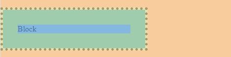
A block-level element occupies the whole width of a row inside its container.
The width of a block-level element can be set. However, if the width of the block-level element is smaller than the width of its container, then the rest of the space is reserved for the block level element.
Example:
.box {display: block;box-sizing: border-box;width: 300px;padding: 30px;border: 5px;}
To center the block, including its border and padding, we can set an auto left and right margin.
.box {display: block;box-sizing: border-box;width: 300px;padding: 30px;border: 5px;margin: 16px auto;}
In the margin: 16px auto; rule, the first value is the top and bottom margin, while the second value ...