What is the CSS grid property?
Grid is one of CSS’s layout tools, which lets you easily implement a complex design layout using the “row and column approach.” Responsive web pages are created easier with a CSS grid without any hassle and consistently across browsers.
CSS grid layout system
Defining the grid layout on a page can be done easily by using the grid property on the parent element.
.parent {display: grid;}
Grid elements
Grid containers
The grid container includes the grid items. It is the parent element that holds all the items under the layout.
.grid-container{
  display: grid;
}
Grid lines
- These are lines that indicate the start and the end of a row or a column.
- These lines are counted from one at the top left corner of the grid and move to the right four columns and to down four rows.
- This happens while increasing the count.
Grid lines can define where to place a grid item inside a grid container.
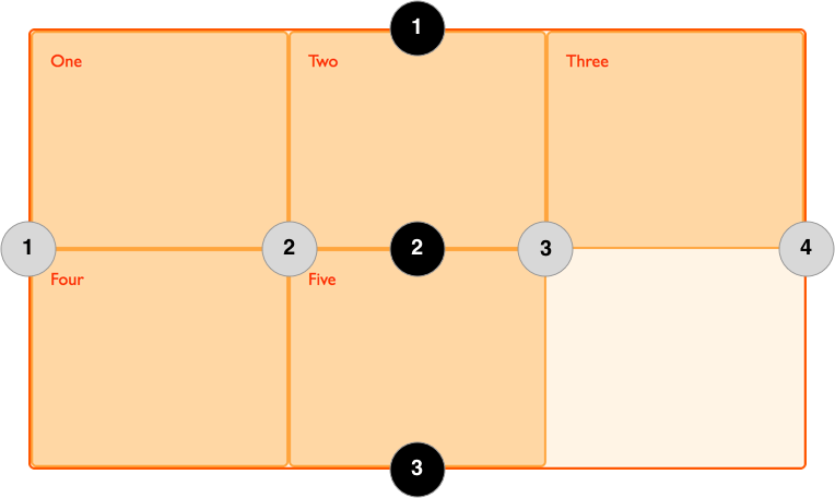
Items can be placed in a particular position in the container with the use of grid lines. We can specify where items should be placed in the grid container.
.grid-item{
grid-column-start: 1; // The line the column starts
grid-column-end: 3; //The line the column ends

grid-row-start: 1; // The line the row starts
grid-row-end: 2; // The line the row ends
}
We can also do this using the shorthand property.
.grid-item{
grid-column: 1 / 3; // grid-column-start / grid-column-end
grid-row: 1 / 2; // grid-row-start / grid-row-end
}
Grid template columns
The grid template column defines the width of columns that would fit within the grid container. It also specifies the number of columns for each row.
.grid-container{
display: grid;
grid-template-columns: 150px 150px 150px;
}
Grid template rows
The grid template row defines the height of rows that would fit within the grid container. It also specifies the number of rows for the grid.
.grid-container{
display: grid;
grid-template-rows: 150px 150px 150px;
}
As an alternative, the repeat() function can be used to define the number of rows and columns. You can have any number of equal-sized rows or columns with this function.
.grid-container{
display: grid;
grid-template-rows: repeat(3, 300px);
  grid-template-columns: repeat(3, 1fr);
}
Fr is a fractional unit, an alternative unit for measurement. 1fr represents 1 portion of the available space.
Grid gap
The grid gap specifies the space between rows or columns or both of them within the grid container.
Rows
.grid-container{
grid-row-gap: 1rem;
}
Columns
.grid-container{
grid-column-gap: 1rem;
}
Or using the short-hand for both of the above properties:
grid-gap: grid-row-gap grid-column-gap
grid-gap:1rem 0.5rem;
This can be tested by experimenting with the demo below:
In the example above, three columns and two rows with grid gaps are created using the grid elements.
Grid areas
These are an alternative to using grid lines.
First, define the names of your chosen grid item with the grid-area property.
.grid-item1{
  grid-area: header;
}
.grid-item2{
  grid-area: main;
}
.grid-item3{
  grid-area: sidebar;
}
.grid-item4{
  grid-area: footer;
}
Then, use the grid-template-areas property to describe the layout.
.grid-container {
  display: grid;
  grid-template-columns: 3fr 3fr 2fr 3fr;
  grid-template-rows: 250px 300px 250px;
  grid-template-areas: "header header header header"
"main main main sidebar"
"footer footer footer footer";
}
In the code above, each word is a
This defines a total of three rows and four columns.
The first row merges four cells as the header area.
The second row merges three cells as the main area and the last cell as the sidebar area.
The last row merges four cells as the footer area.
You can use a period . for an empty cell.
You can check this out using the demo below:
Grid item properties
In a CSS Grid, each grid item has certain properties that define how they are placed in the container.
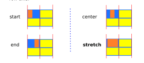
justify-self
justify-self defines how the contents of an item are placed in a single
.grid-item{
justify-self:value;
}
The value can either be:
-
stretch: This is the default value; the content fills the whole width of the grid box.
-
start: Aligns the content at the beginning from the left of the grid box.
-
center: Aligns the content in the center of the grid box.
-
end: Aligns the content at the end from the right of the grid box.
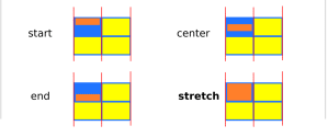
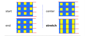
align-self
align-self defines how the contents of an item are placed in a single cell vertically.
.grid-item{
align-self:value;
}
The value can either be:
-
stretch: This is the default value. The content fills the whole height of the grid box.
-
start: Aligns the content at the beginning from the left of the grid box.
-
center: Aligns the content in the center of the grid box.
-
end: Aligns the content at the end from the right of the grid box.
The items can be placed together in the grid container instead of individually as stated above using these properties:
justify-items
justify-items aligns all the items in the same part horizontally.
.grid-container{
justify-item:value;
}
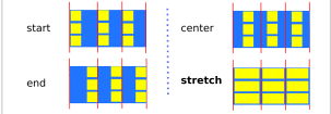
align-items
align-items aligns all the items in the same part vertically.
.grid-container{
align-items:value;
}
You can check this out using the demo below: