AI-powered learning
Save this course
Data Storytelling through Visualizations in Python
Gain insights into data storytelling in Python using Matplotlib, Seaborn, and Plotly. Explore trends, handle data challenges, and create impactful visual narratives aligning with business goals.
4.7
38 Lessons
2 Projects
9h
Join 3 million developers at
Join 3 million developers at
LEARNING OBJECTIVES
- Familiarity with the best practices in the field of data storytelling
- Understanding the process of extracting narratives from data
- Basic understanding of data analysis strategies using pandas and NumPy
- An understanding of data storytelling and visualization generation for real-world, messy data
- Hands-on experience with compelling visualizations using Matplotlib and Plotly
Learning Roadmap
2.
Effective Data Analysis and Visualization
Effective Data Analysis and Visualization
Unpack the core of visualizing data, exploring trends, and analyzing correlations in datasets.
3.
Extracting Narratives from Data
Extracting Narratives from Data
6 Lessons
6 Lessons
Examine defining problem statements, iterative visualization, audience tailoring, persona characterization, and correlation vs. causation in data storytelling.
4.
Tackling Real-World Data
Tackling Real-World Data
6 Lessons
6 Lessons
Break down the steps to handle real-world data, including outliers, missing data, and forecasts.
5.
Data Presentation
Data Presentation
7 Lessons
7 Lessons
Solve problems in presenting data effectively with engaging narratives, layering, and interactive visualizations.
6.
Data Types and Sources
Data Types and Sources
3 Lessons
3 Lessons
Follow the process of integrating, visualizing text and image data to enhance storytelling.
7.
Data Storytelling Best Practices
Data Storytelling Best Practices
6 Lessons
6 Lessons
Piece together the parts of creating concise, consistent, and unbiased data visualizations using effective color schemes and balanced content.
Certificate of Completion
Showcase your accomplishment by sharing your certificate of completion.
Complete more lessons to unlock your certificate
Developed by MAANG Engineers
ABOUT THIS COURSE
Mining the insights from data is the next critical step after parsing data and generating visualizations. This activity is called data storytelling, where you form a cohesive story explaining the strengths, weaknesses, and trends of your dataset with the help of predictions through machine learning models.
In this course, you will learn how to identify and evaluate your data for trends, handle common real-world challenges of messy data such as large datasets and missing values, and present the right visualizations for different kinds of data. We will use Python, Matplotlib, Seaborn, and Plotly as the data science libraries for this course.
This course will help you develop the key skills to translate the technical indicators in line with business objectives. It also aids in building your technical skills and processes to create effective data visualizations and narratives. Data storytelling can help you unlock actionable insights from your data.
ABOUT THE AUTHOR

Ria Cheruvu
I am an Al SW Architect at Intel and have a master's degree in data science from Harvard University. I’m an instructor of data science curricula.
Trusted by 3 million developers working at companies
A
Anthony Walker
@_webarchitect_
E
Evan Dunbar
ML Engineer
S
Software Developer
Carlos Matias La Borde
S
Souvik Kundu
Front-end Developer
V
Vinay Krishnaiah
Software Developer
Built for 10x Developers
No Passive Learning
Learn by building with project-based lessons and in-browser code editor
Personalized Roadmaps
The platform adapts to your strengths & skills gaps as you go
Future-proof Your Career
Get hands-on with in-demand skills

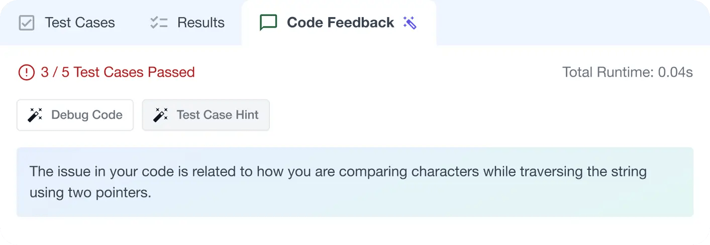
AI Code Mentor
Write better code with AI feedback, smart debugging, and "Ask AI"
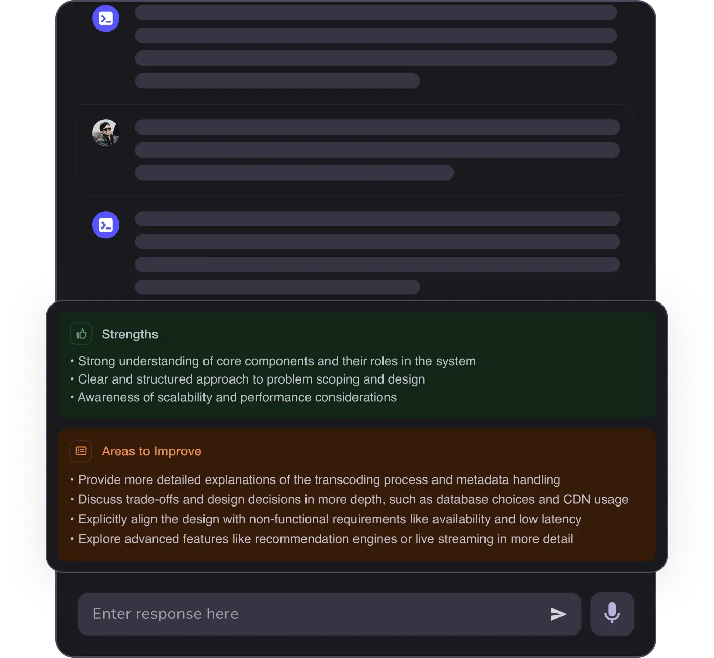
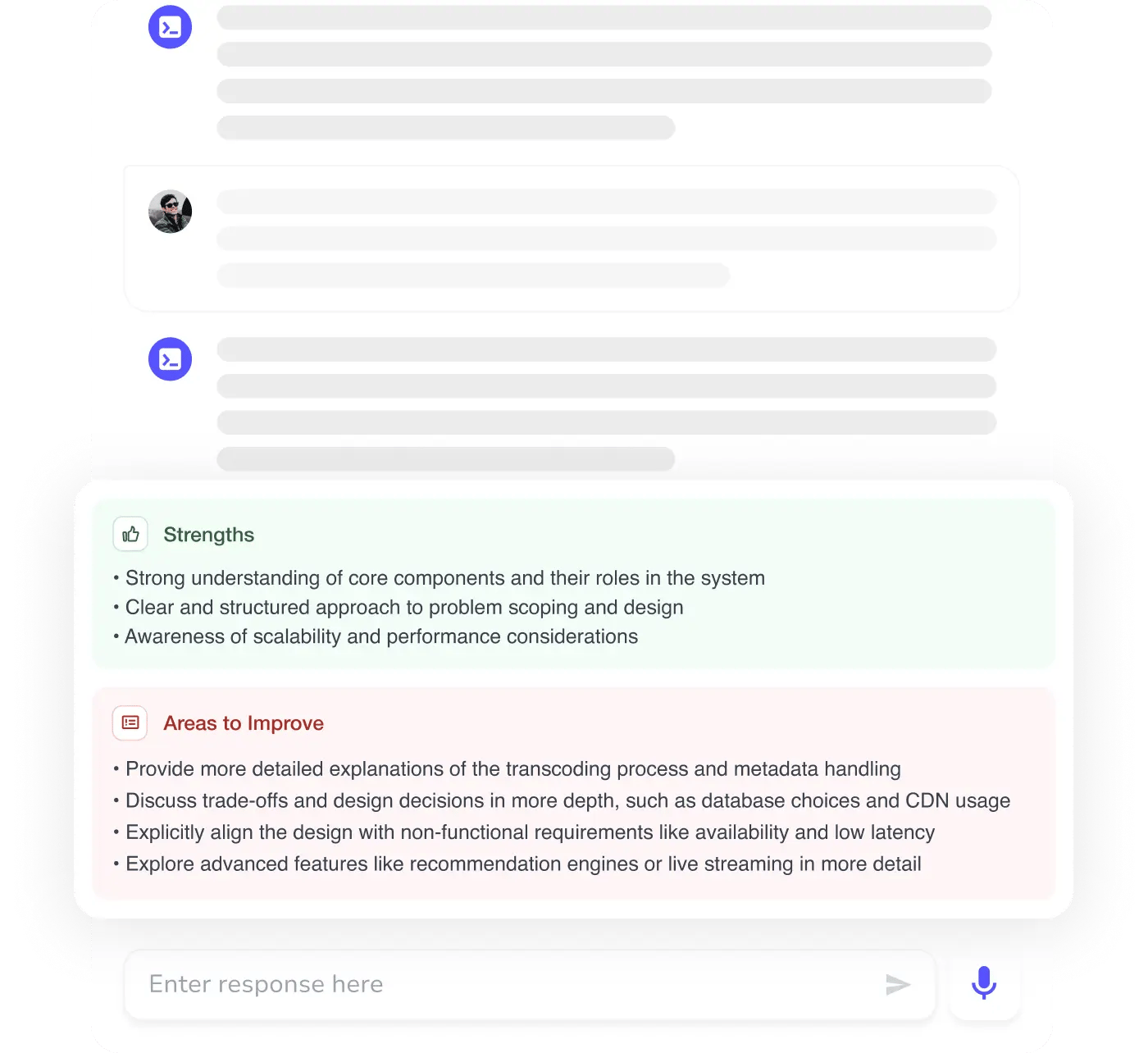
MAANG+ Interview Prep
AI Mock Interviews simulate every technical loop at top companies
Free Resources
