AI-powered learning
Save this course
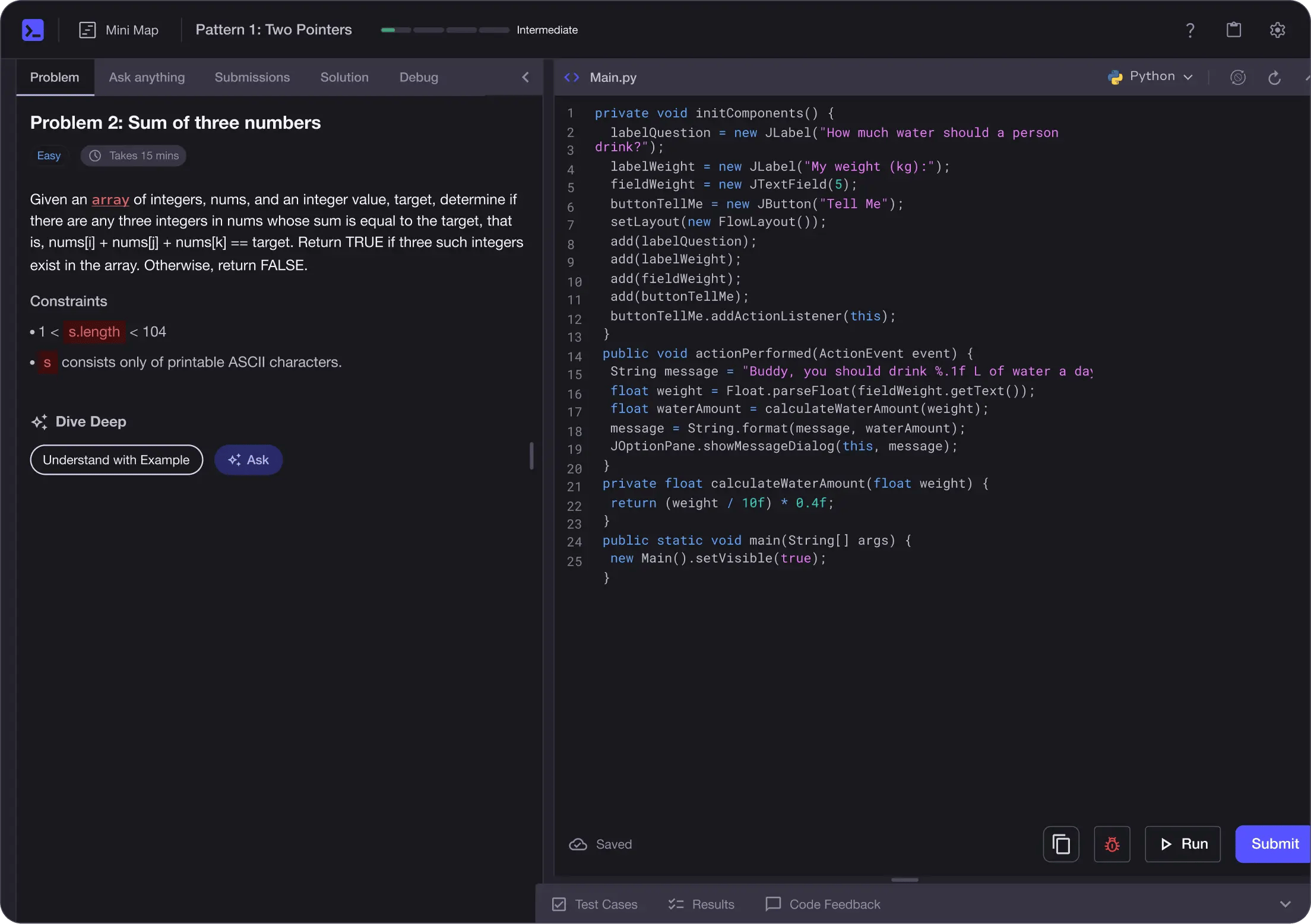
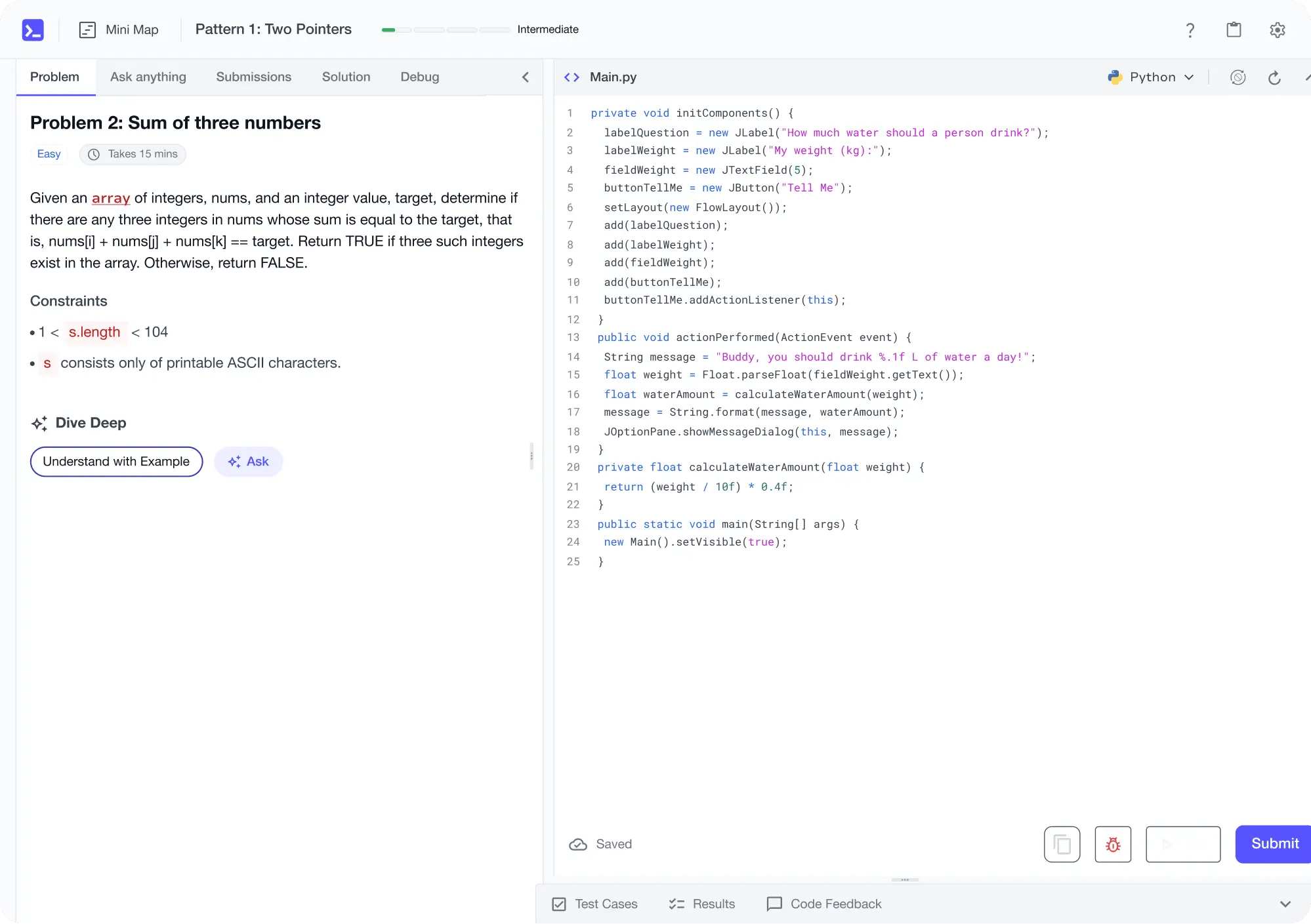
Matplotlib for Python: Visually Represent Data with Plots
Gain insights into visually representing data with Matplotlib in Python. Explore plotting techniques, control axes, create complex layouts, and draw various plots, enhancing your data science skills.
4.4
32 Lessons
6h
Updated 2 months ago
Join 3 million developers at
Join 3 million developers at
LEARNING OBJECTIVES
- Identify Matplotlib figure, axes, and axis elements and explain their roles in a plot
- Create figures using pyplot, Axes objects, and Figure objects to plot multiple lines
- Customize ticks, grid lines, titles, and spines to improve plot clarity and style
- Add legends, annotations, and text (including math formulas) to communicate insights
- Design multi-plot figures with subplots and GridSpec to build complex layouts
- Draw and style common plots (line, scatter, bar, histogram, pie, box, stem, stack, radar, heatmap)
- Apply colors, colormaps, colorbars, error bars, fill_between, and 3D surfaces to enrich visuals
Learning Roadmap
1.
Introduction
Introduction
Get familiar with Matplotlib fundamentals for creating versatile data visualizations in Python.
2.
How to Draw Various Plot Elements
How to Draw Various Plot Elements
Walk through various plot elements in Matplotlib, customizing ticks, spines, legends, text, grids, and colors.
How to Draw a FigureOther Methods for Drawing a FigureSetting the Tick for a PlotControlling the SpineAdding a Legend to the PlotUsing Annotate to Identify Data PointsAdding Text to a PlotUsing the Grid to Help Locate DataSetting the Title of a PlotPlacing Multiple Plots onto One Figure Using SubplotsCreating Complex Layouts with GridSpecColorsQuiz: Figure Elements
3.
How to Draw Different Types of Plots
How to Draw Different Types of Plots
17 Lessons
17 Lessons
Work your way through creating various plots in Matplotlib to enhance data visualization.
Certificate of Completion
Showcase your accomplishment by sharing your certificate of completion.
Complete more lessons to unlock your certificate
Developed by MAANG Engineers
ABOUT THIS COURSE
For data science, Matplotlib is one of the most popular tools for representing data in a visual manner. There are many other tools, but for the Python user, Matplotlib is a must-know.
In this course, you will learn how to visually represent data in several different ways. You will learn how to use figures and axes to plot a chart, as well as how to plot from multiple types of objects and modules.
You will also discover ways to control the spine of an axes and how to create complex layouts for a figure using GridSpec so you can create visually stunning charts.
In the latter half of the course, you will focus on how to draw various types of plots, whether it be a line plot, a stem plot, or a heatmap plot. Overall, this is your no-fuss introduction to creating impactful data charts.
By the end, you will have an important new skill to add to your resume. As any data scientist knows, it is necessary that you be able to show insights found from analyzing data.
ABOUT THE AUTHOR

Neko Yan
Data lovers, machine learning enthusiasts. Senior machine learning researcher in NLP, reinforcement learning, and display advertisement prediction.
Trusted by 3 million developers working at companies
A
Anthony Walker
@_webarchitect_
E
Evan Dunbar
ML Engineer
S
Software Developer
Carlos Matias La Borde
S
Souvik Kundu
Front-end Developer
V
Vinay Krishnaiah
Software Developer
Built for 10x Developers
No Passive Learning
Learn by building with project-based lessons and in-browser code editor
Personalized Roadmaps
The platform adapts to your strengths & skills gaps as you go


Future-proof Your Career
Get hands-on with in-demand skills


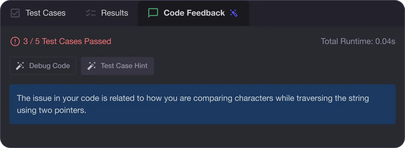
AI Code Mentor
Write better code with AI feedback, smart debugging, and "Ask AI"
MAANG+ Interview Prep
AI Mock Interviews simulate every technical loop at top companies


Free Resources
