Join 3 million developers at
Join 3 million developers at
LEARNING OBJECTIVES
- Learn the basics of creating web layouts
- Understand how Flexbox works
- Get hands on experience in designing mobile-responsive web layouts using Flexbox
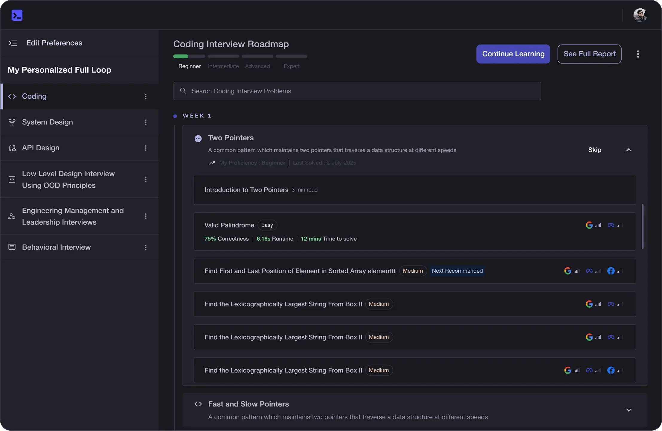
Learning Roadmap
1.
Getting Started
Getting Started
Get familiar with essential CSS concepts, box model, and responsive design using Flexbox.
2.
Using Flexbox Containers
Using Flexbox Containers
Walk through the essentials of Flexbox containers, covering alignment, wrapping, and directional layouts.
Introduction to FlexboxUsing Flexbox - ExerciseUsing Flexbox - SolutionsFlex-directionFlex-direction ExerciseFlex-direction SolutionJustify-contentJustify-content ExercisesJustify-content SolutionAlign-itemsAlign-items ExercisesAlign-items SolutionFlex-wrapFlex-wrap ExercisesFlex-wrap SolutionFlex-flow: Combining flex-direction and flex-wrapAlign-contentAlign-content ExerciseAlign-content SolutionFlex Container QuizUsing Flexbox Containers - Summary
3.
Aligning Individual Flexbox Items
Aligning Individual Flexbox Items
18 Lessons
18 Lessons
Work your way through aligning flex items using properties like align-self, flex-grow, and order.
4.
Designing a Mobile-first Website Using Flexbox
Designing a Mobile-first Website Using Flexbox
13 Lessons
13 Lessons
Apply your skills to create a mobile-first website using Flexbox for responsive design.
Certificate of Completion
Showcase your accomplishment by sharing your certificate of completion.
Complete more lessons to unlock your certificate
Developed by MAANG Engineers
ABOUT THIS COURSE
In this course, you will get hands-on experience in designing mobile-responsive web layouts using Flexbox. You will start with the basics like the Box Model and the process of layouting.
You will then move on to advanced concepts such as Flexbox containers, and aligning individual Flexbox items. Near the end of the course, you will put everything you just learned into practice. You will work on a project that focuses on developing a mobile-first website where you’ll experiment with page layout, headers, footers, and a lot more.
By the end of this course, you will be able to use Flexbox in your own projects to create beautiful layouts.
ABOUT THE AUTHOR
Zsolt Nagy
Zsolt Nagy specializes in maintainable JavaScript applications since 2010. He is the founder of the following blogs: zsoltnagy.eu and devcareermastery.com.
Trusted by 3 million developers working at companies
A
Anthony Walker
@_webarchitect_
E
Evan Dunbar
ML Engineer
S
Software Developer
Carlos Matias La Borde
S
Souvik Kundu
Front-end Developer
V
Vinay Krishnaiah
Software Developer
Built for 10x Developers
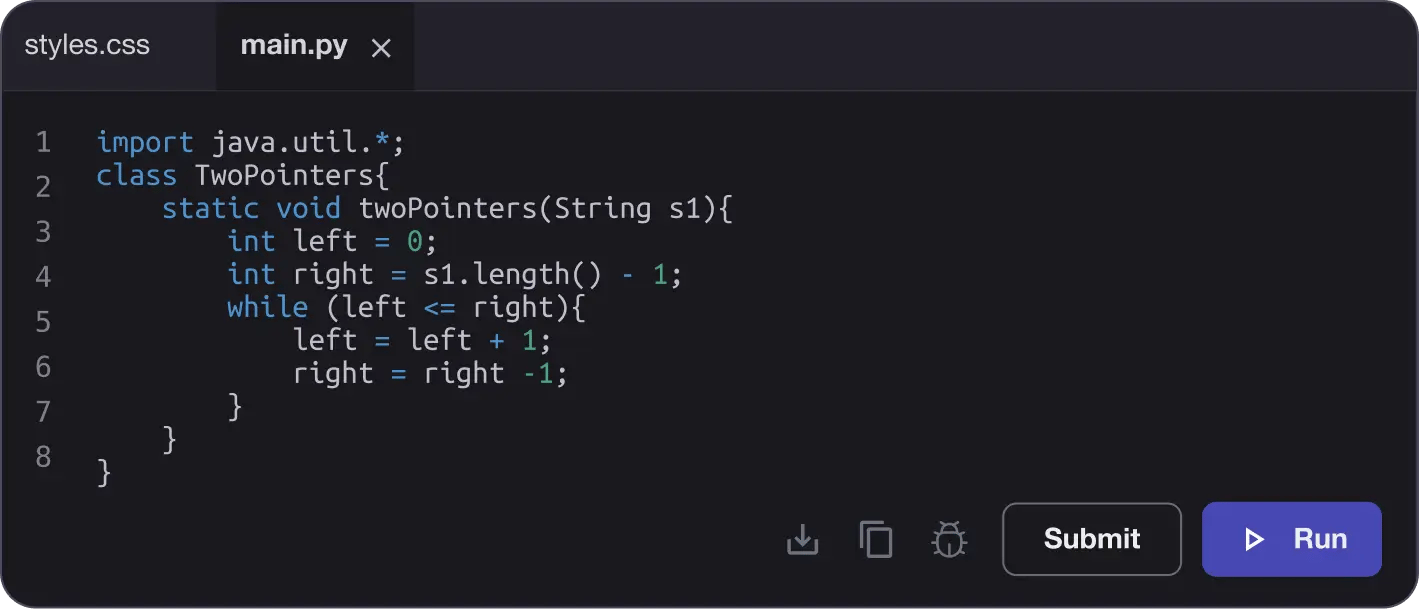
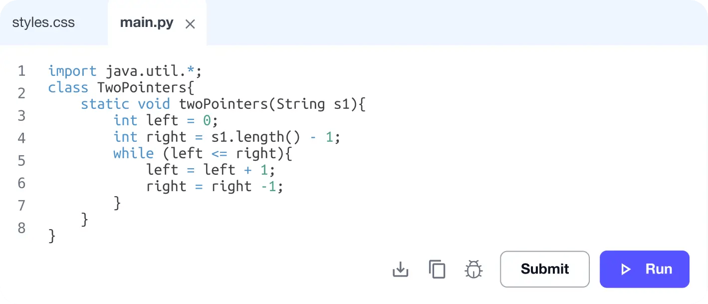
No Passive Learning
Learn by building with project-based lessons and in-browser code editor
Personalized Roadmaps
The platform adapts to your strengths & skills gaps as you go
Future-proof Your Career
Get hands-on with in-demand skills
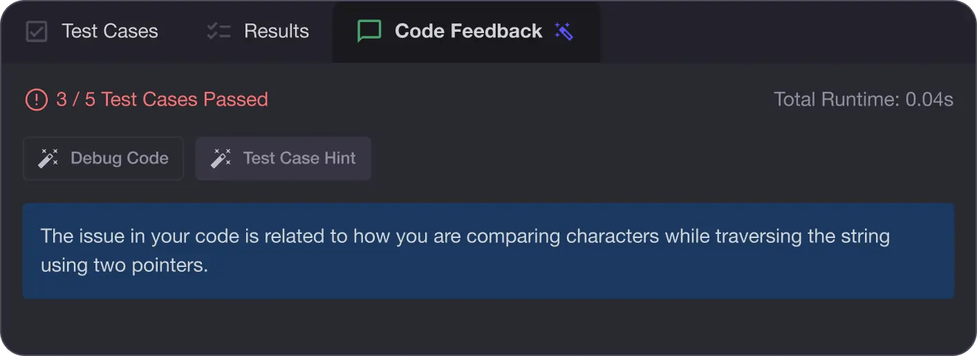
AI Code Mentor
Write better code with AI feedback, smart debugging, and "Ask AI"
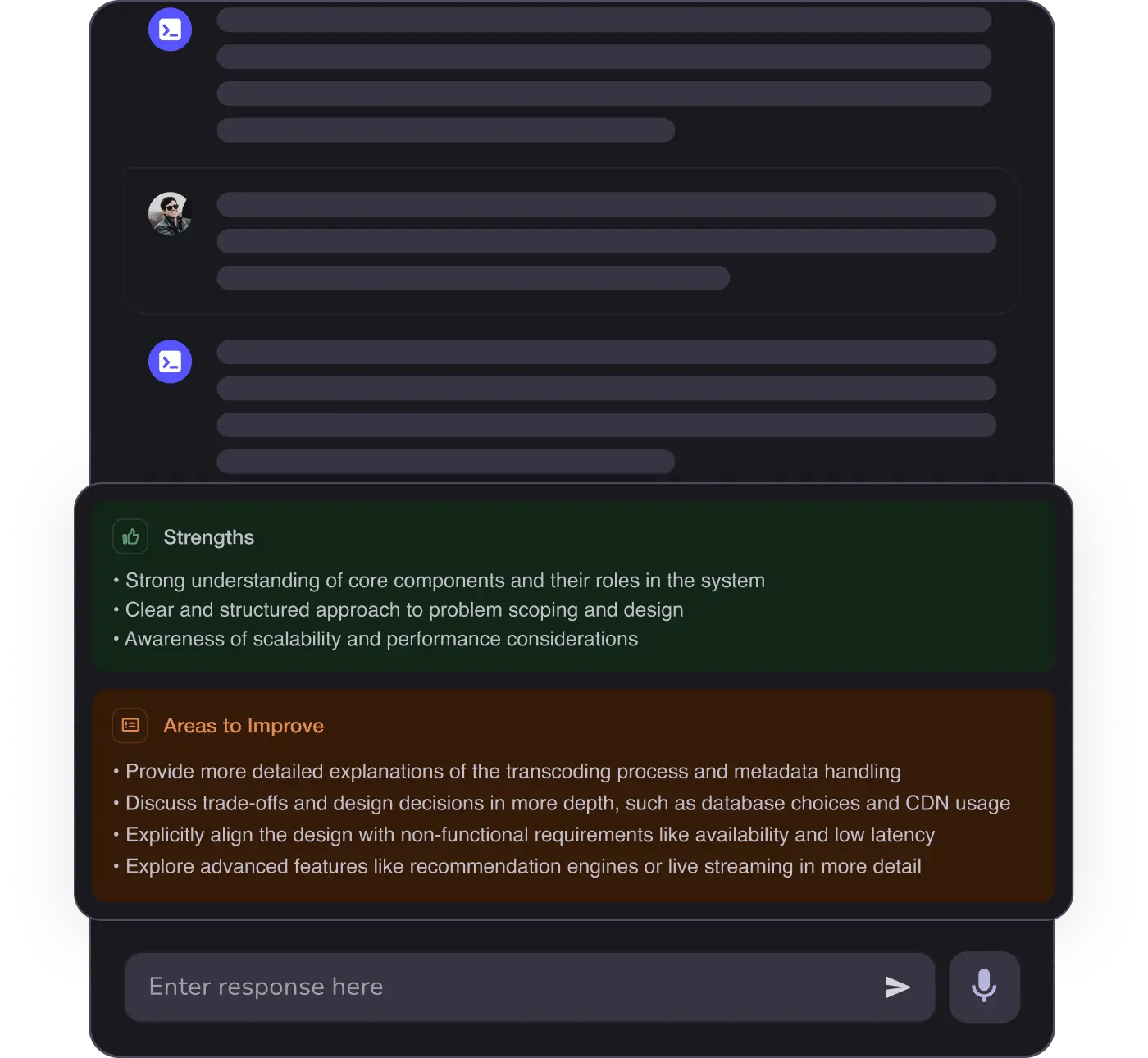
MAANG+ Interview Prep
AI Mock Interviews simulate every technical loop at top companies
Free Resources
